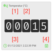
The dashboard visualizes the states. When adding a state, a corresponding element is automatically added to the dashboard.
Beside the value itself, each tile shows the name 1, the measurement unit 2 and the timestamp of the last update 3 as well. With the calendar icon 4, you can display past values (for numeric data states).
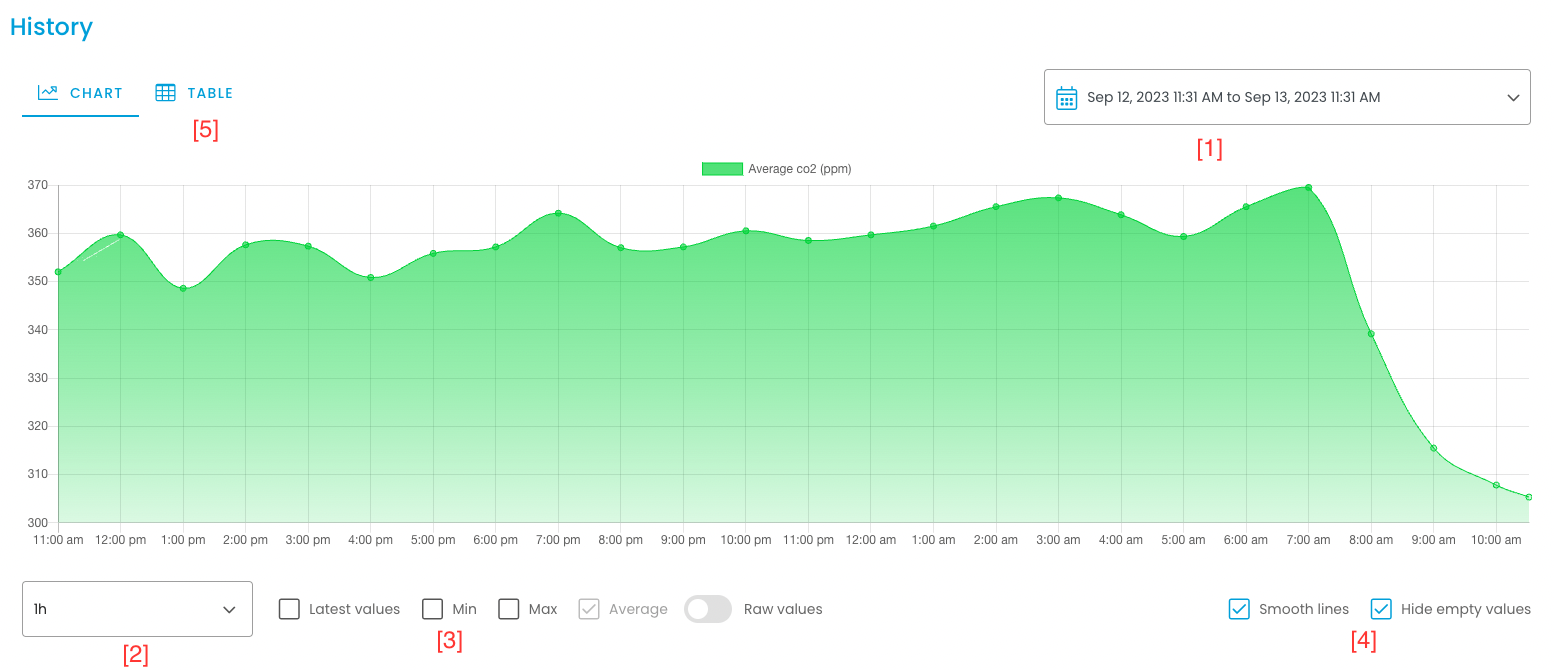
View data states’ history
With the calendar icon () on each tile you can (for numeric data states) see the historical values. The data can be displayed as diagram as well as in a table.
In the diagram, the shown data points are an aggregation of the corresponding raw data for the interval. Due to technical constraints, this aggregation is necessary, especially for longer timespans.
With the date picker on the top right 1, you can select the timespan (x-axis). With the dropdown list on the bottom left 2, you can choose how long a data point’s interval should be. Beside, you can activate/ deactivate different graphs to display the minimum, maximum and average for the interval 3. With the checkbox “smoothen lines” you can smoothen the graph. The checkbox “hide empty values” lets you remove timespans with no data 4. The option “Raw values” shows the last 50 values without any aggregation at the exact time of data entry.
In the second tab, you can find a table with the raw data for the selected timespan. Due to technical constraints, this list is limited to 1000 values.